The Colour of Happiness

As part of our ‘Happy May Month’ we have taken a look at colour and how if affects our mood. Obviously there isn’t simply one colour that causes happiness, but it has been well documented that colour can affect mood. Perhaps unsurprisingly, some of the main HAPPY colours are linked to nature. Blues and yellows are linked in our brains to sunny days and blue skies. Greens, pinks and oranges are also high on the list of ‘happy colours’. These lovely colours are reminiscent of gardens in spring and summer; beautiful flowers and plants in the garden. Knowledge of ‘happy’ colours can help you decide what clothes to wear, or how to decorate a
room.
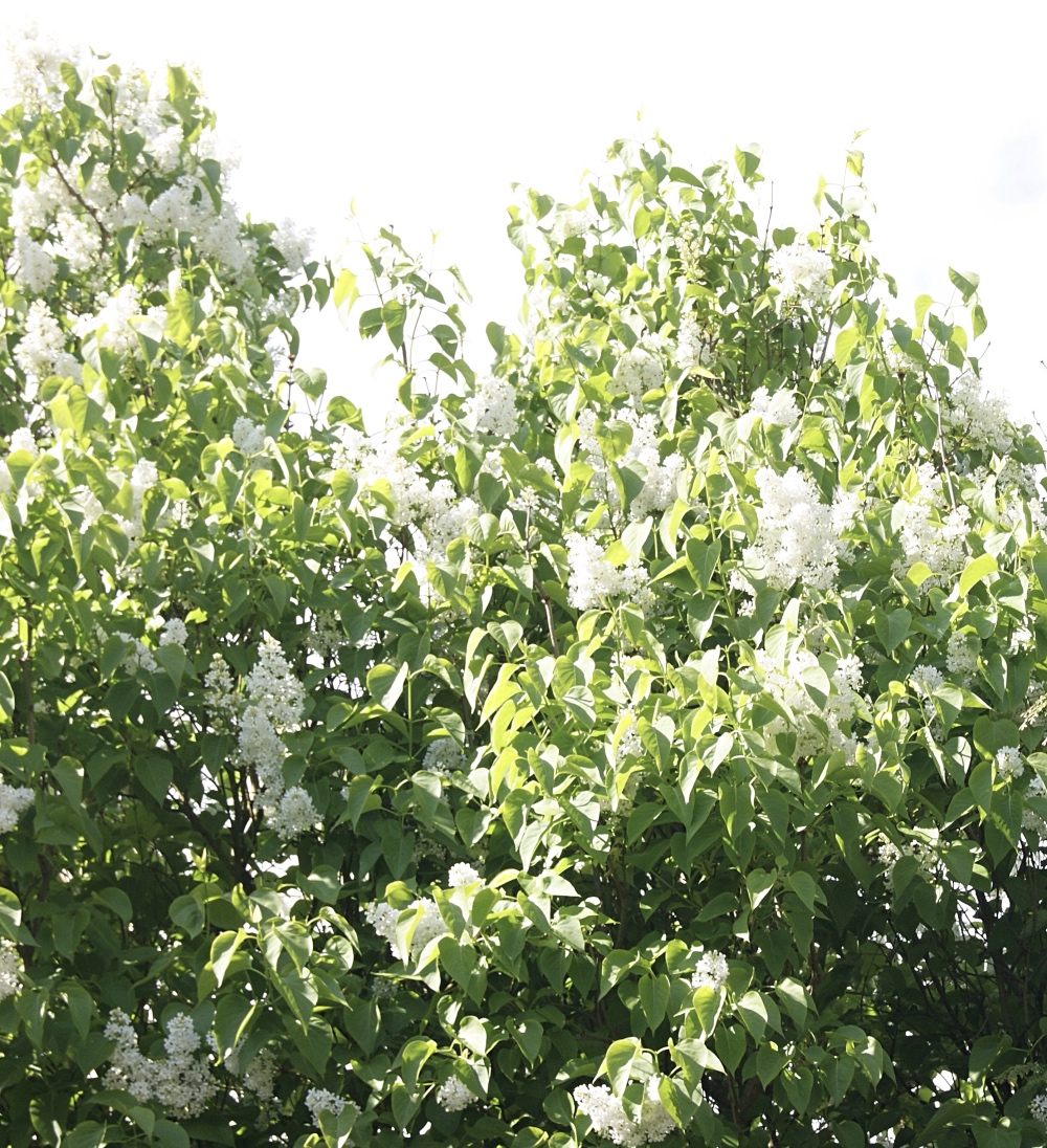
Nature is a big influenceon positive, ‘happy’ colours.
It goes without saying (but we are going to say it anyway), colours only work as happy colours if you actually like the colour. There is no point painting a room a colour you
don’t like in order to try and feel happy. Pink may be one of the colours of the season, but if a
pink bathroom gives you flashbacks to the awful ALL pink bathroom suite you grew up with, it isn’t necessarily going to bring you happiness. On the other hand, a little nostalgia can be lovely and if you loved your all-pink bathroom growing up, it is likely that adding a little pink to your home now would affect your mood in a positive way.
If you are planning on painting your room with a happiness palette, the colours we have mentioned are great colours to start researching.
Established in 1773, Little Greene produces a stunning range of paints and wall-papers, that are all made in the UK. Little Greene are also ethically and environmentally responsible, something that fits well with our company ethos. We spoke to David Mottershead, MD at the Little Greene paint company, about what makes him happy and how he thinks colour can affect mood. Here is what he had to say:
 To be truly happy, surround yourself with people and things you love – and for me that includes colours I love. Happiness for me is to walk into a room and see a colour on a wall that fills my heart with song and lifts a scheme from the ordinary to the extraordinary. Shades like Trumpet 196 and Phthalo Green 199 add verve and zest to a room: they invigorate and refresh and are perfect for adding vibrancy to the hard working rooms of the house.
My happy place is looking out at an uninterrupted ocean – or up at a huge blue sky – and for me our special edition paint, Ultra Blue has the same effect. It has a feeling of optimistic endlessness and allows the mind to wander and the eyes to relax into the middle distance.
For a quirky take on happiness, I adore unexpected colour combinations that make visitors to my home smile – for example calm and collected Slaked Lime with a touch of vibrant Leather.
Neutrals are popular in homes and often easier to accessorise but if you are someone who avoids big examples of colour it can be nice to add little flashes of these happy colours, either in muted tones or small amounts. This is one reasons we love our cushions from Anna Loom, and Rosehip and Wild, they both add splashes of summer and happy colour into a room without overtaking it. Both these designers use neutrals as backing colours to soften the vibrancy of the colours they use in their work.
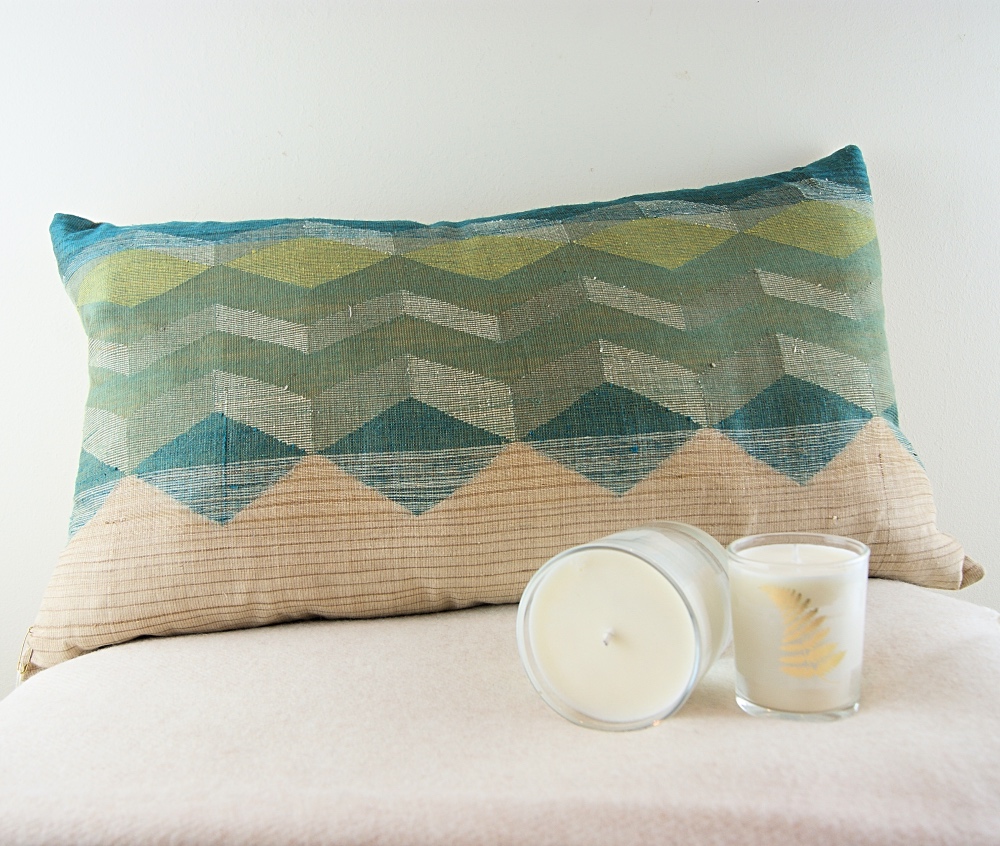
Anna Loom Silk Cushion- Neutrals one side, with beautiful on trend nature colours on the other side.
Would adding a little splash of colour to your home help your mood? It doesn’t have to be as major as re-painting your home. Though looking at Little Greene’s stunning palette, decorating a room has become extremely tempting. Bringing in some flowers from the garden, or adding a painting you love to a room can lift the mood of a room (The Affordable Art Fair is in London this month and well worth a visit to see new and already popular artists and their work at accessible prices).
And remember, however effective colour psychology is, mood is still affected by you and your experiences- so choose a colour you love. Personally I love blues…blue sky, blue sea, blue walls, beautiful!
To celebrate these wonderful ‘happy’ colours, and hopefully make you even more happy, we are giving you all 20% off our Anna Loom and Rosehip & Wild ranges for this week only 8th-14th May.

Image Information:
Top Image:-£52.67 for 2.5L Ultra Blue, special edition paint in Absolute Matt Emulsion finish
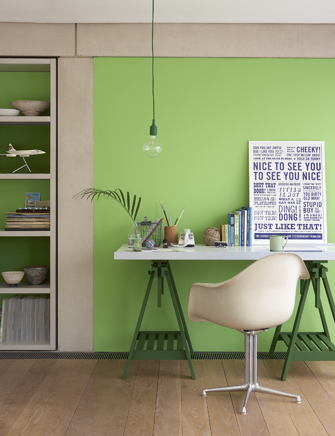
Second Image:-Little Greene Retrospectives: Study – Image 11
Paints:
Walls and back of shelves: Phthalo Green 199. (70s) Absolute Matt Emulsion
Trestle legs and back of shelves: Lawnmower Green 200. (70s) Absolute Matt Emulsion
Shelves: French Grey 113. (V) Intelligent Eggshell
£42.00 for 2.5L Absolute Matt Emulsion
£61.00 for 2.5L Intelligent Eggshell
Extra information: 1L prices (for smaller projects)
£21.00 for 1L Absolute Matt Emulsion
£29.00 for 1L Intelligent Eggshell
Stockist no 020 7935 8844
www.littlegreene.com
Instagram: @littlegreenepaintcompany
Twitter: @LittleGreene
3rd Image:-Image 22: Little Greene – Colours of England
Cornicing: Slaked Lime 105
Highlight Stripe: Leather 191
Wall: Pea Green 91
Skirting and Panelling: Obsidian Green 216
£42.00 for 2.5L Absolute Matt Emulsion
£47.00 for 2.5L Intelligent Matt Emulsion
£59.00 for 2.5L Intelligent Eggshell
£65.00 for 2.5L Floor Paint
Extra information: 1L prices (for smaller projects)
£21.00 for 1L Absolute Matt Emulsion
£23.00 for 1L Intelligent Matt Emulsion
£29.00 for 1L Intelligent Eggshell
£30.00 for 1L Floor Paint
Stockist no 020 7935 8844
www.littlegreene.com
Leave a Reply
Want to join the discussion?Feel free to contribute!